When selecting typography, a solid understanding of the fundamentals of various types and styles is crucial for making informed decisions.
How typography is referenced
Typography styles change based on the tool. This overview explains how HDS typography standards work in each tool.
In Figma, reusable text styles are called “Text Styles” and are categorized and stored in the “text panel” to be used in text-based elements. Text styles directly reference font family, weight, line height, size, and many other text-based properties within a single style and are manually maintained. Some Figma styles include:
Display/500/BoldBody/300/RegularCode/300/Regular
In code, these styles are constructed differently using “Tokens.” Tokens are generated from an agnostic JSON file and differ from Figma “Text Styles” because a single token does not reference multiple font properties. Instead, each Token defines the different properties of a single text style. This means that constructing the equivalence of Figma’s Text Style Display/500/Bold would use the following tokens:
font-family: var(--token-typography-display-500-font-family);font-size:var(--token-typography-display-500-font-size);line-height:var(--token-typography-display-500-line-height);font-weight:var(--token-typography-font-weight-bold);
Rather than calling upon each of these tokens in code every time text is styled, the Text Component was created to replicate how Figma styles group text-based properties. Additional CSS helper classes have been created to ease the style creation process, if necessary.
Font families
In code, Helios uses default system fonts because they are stable, support internationalization, and improve performance by reducing resource load—key for large applications at HashiCorp.
In Figma, our design tooling and libraries use SF Pro font family exclusively and we recommend using this font stack for consistency.
While text styling varies slightly across operating systems, users will have a consistent and expected experience within each OS.
Sans-serif
Mac + iOS sans-serif font
Large text (20px and above): SF Pro Display
Small text (19px and lower): SF Pro Text
Windows sans-serif font
Large text (20px and above): Segoe UI Display

Small text (19px and lower): Segoe UI Text
Linux sans-serif font
Linux sans-serif system font dependant on the Linux distribution

Monospace
Mac + iOS monospace font
Safari 13+: SF Mono
All else: Menlo
Windows
Consolas
Linux
Linux monospace system font dependant on the Linux distribution

Font weights
In addition to font size, font weight helps create different levels of emphasis throughout the UI. Font weights include:
- 400 (regular)
- 500 (medium)
- 600 (semi bold)
- 700 (bold)
Within these ranges, bold is used only for display and some code text styles, while regular is associated with body text styles which may include code.
Text styles
Display
Display styles should be used for headings or visual emphasis (like remaining balances). Unless used for visual emphasis, if the display text looks like a page heading, it should use an HTML heading tag.
Display text styles are available in the following sizes and weights:
- Display 500 (30px) - Bold
- Display 400 (24px) - Bold
- Display 400 (24px) - Semibold
- Display 400 (24px) - Medium
- Display 300 (18px) - Bold
- Display 300 (18px) - Semibold
- Display 300 (18px) - Medium
- Display 200 (16px) - Semibold
- Display 100 (13px) - Medium
Body
Body styles should be used for all general page content. Commonly placed within components (like buttons) and blocks of text, this style supports different font weights and sizes to establish a clear visual hierarchy. Body 200 is used as the default body content size as the majority of HashiCorp products are data dense. Body 100 is often used as secondary text for hierarchical purposes while Body 300 is used for bigger UI elements like the large variant of the Button component.
Body text styles are available in the following weights and sizes:
- Body 300 (16px) - Semibold
- Body 300 (16px) - Medium
- Body 300 (16px) - Regular
- Body 200 (14px) - Semibold
- Body 200 (14px) - Medium
- Body 200 (14px) - Regular
- Body 100 (13px) - Semibold
- Body 100 (13px) - Medium
- Body 100 (13px) - Regular
Code
Code styles are used exclusively for text representing code in the UI (like the Code Block component).
Code text styles come in the following weights and sizes:
- Code 300 (16px) - Bold
- Code 300 (16px) - Regular
- Code 200 (14px) - Bold
- Code 200 (14px) - Regular
- Code 100 (13px) - Bold
- Code 100 (13px) - Regular
How typography is used
Body content
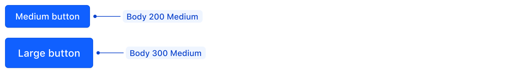
Body 200 is the default font size for body content. Scaling up or down is used as a means to create visual hierarchy in page UI, or component usage. As an example, the Button, medium (default) variant is sized at Body 200 while the large variant is Body 300.
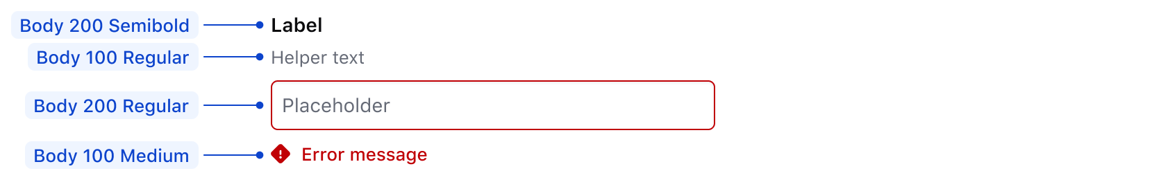
Similarly, form fields' labels and input texts are Body 200, while any other secondary information, like helper text or error messages are sized at Body 100. This ensures that primary information is more prominent with the larger size for visual hierarchy.
For more details about form patterns, read the form patterns documentation.
Semantic heading or not?
The Text component does not equate a specific style (Body, Display, or Code) with a specific HTML semantic structure (like <p/>, <h1/> or <span>), it is up to the consumer to define the logical semantic element for the each piece of text. To ensure accessible page content, the scaling of the Display styles often are associated with the scaling of the HTML headings such as:
- Display 500 → H1
- Display 400 → H2
- Display 300 → H3
- Display 200 → H4
- Display 100 → H5
In general we recommend mapping Display font sizes sequentially to markup, but this is not always possible. Additionally, Display text styles do not always need to be headings. They may be used to emphasize important information, such as remaining balances, so that users are able to visually understand the level of importance of information on the page.
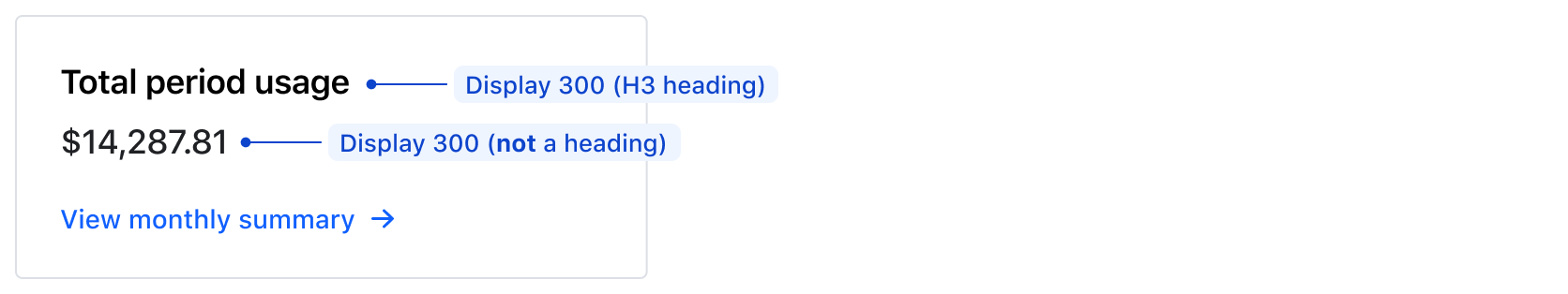
An important note: The card is still following the semantically correct logical order of headings, where “Total period usage” is a heading (an H3 with semibold weight), while the balance below it is not (medium weight as a span or paragraph). Font weight is used to create the visual hierarchy here instead size.
How to use these styles
We offer different ways to apply typography styles to UI elements:
- Text helper component: This is the preferred way to apply HDS text styles to HTML elements.
- CSS helper classes: This can be used to apply styles to Ember components (or as fallback when using the
Texthelper component is not possible). - Design tokens: This should be the last resort when none of the previous options are possible (or when only some of the HDS style properties are needed, like
font-family,font-size,line-height, etc.)
Text component
This helper component provides a handy way to declare an HTML tag and apply to it one of the predefined typographic styles (via CSS helper classes, this happens automatically under the hood), plus a set of other properties like color and alignment.
For details about this component, see the Text page.
CSS helper classes
In a single declaration, these predefined CSS classes contain everything to apply a standard typographic style to an element: font-family, font-size, line-height, and a reset for margin and padding to match the intended design language.
<p class="hds-typography-display-300">The quick brown fox jumps over the lazy dog.</p>
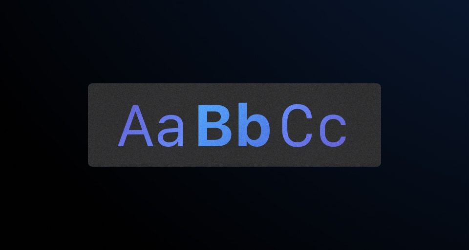
Font styles
-
Aa
-
Aa
-
Aa
-
Aa
-
Aa
-
Aa
-
Aa
-
Aa
-
Aa
-
Aa
-
Aa
Font family
While we don’t recommend using custom styles often, font-family helpers are available to change the font family of an element.
<p class="hds-font-family-sans-text">The quick brown fox jumps over the lazy dog.</p>
font-family helpers |
Use for |
|---|---|
font-family-sans-display |
Headings and titles |
font-family-sans-text |
Body copy |
font-family-mono-code |
Monospaced text |
-
Aa
-
Aa
-
Aa
Font weight
Use the font-weight helpers to change the weight of text in an element.
<!-- with font-family CSS helpers -->
<p class="hds-font-family-sans-text hds-font-weight-medium">The quick brown fox jumps over the lazy dog.</p>

<!-- with typographic style CSS helpers -->
<p class="hds-typography-display-300 hds-font-weight-semibold">The quick brown fox jumps over the lazy dog.</p>
-
Aa
-
Aa
-
Aa
-
Aa
Style and weight
The following are recommended style and weight combinations for use in our applications:
-
The quick brown fox jumps over the lazy dog.
display-500 (bold) -
The quick brown fox jumps over the lazy dog.
display-400 (medium) -
The quick brown fox jumps over the lazy dog.
display-400 (semibold) -
The quick brown fox jumps over the lazy dog.
display-400 (bold) -
The quick brown fox jumps over the lazy dog.
display-300 (medium) -
The quick brown fox jumps over the lazy dog.
display-300 (semibold) -
The quick brown fox jumps over the lazy dog.
display-300 (bold) -
The quick brown fox jumps over the lazy dog.
display-200 (semibold) -
The quick brown fox jumps over the lazy dog.
display-100 (medium) -
The quick brown fox jumps over the lazy dog.
body-300 (regular) -
The quick brown fox jumps over the lazy dog.
body-300 (medium) -
The quick brown fox jumps over the lazy dog.
body-300 (semibold) -
The quick brown fox jumps over the lazy dog.
body-200 (regular) -
The quick brown fox jumps over the lazy dog.
body-200 (medium) -
The quick brown fox jumps over the lazy dog.
body-200 (semibold) -
The quick brown fox jumps over the lazy dog.
body-100 (regular) -
The quick brown fox jumps over the lazy dog.
body-100 (medium) -
The quick brown fox jumps over the lazy dog.
body-100 (semibold) -
The quick brown fox jumps over the lazy dog.
code-300 (regular) -
The quick brown fox jumps over the lazy dog.
code-300 (bold) -
The quick brown fox jumps over the lazy dog.
code-200 (regular) -
The quick brown fox jumps over the lazy dog.
code-200 (bold) -
The quick brown fox jumps over the lazy dog.
code-100 (regular) -
The quick brown fox jumps over the lazy dog.
code-100 (bold)
Design tokens
Helios offers numerous typographic design tokens should your project require more flexibility.
Since these are “atomic” definitions that associate a particular typographic property (e.g., font-size, line-height, letter-spacing, etc.) to a single value, we don’t consider them “typographic” styles. Therefore, we advise against using them directly in your CSS and recommend using the CSS helper classes instead.